Christ’s Abode
When you call my name its like a little prayer
I’m down on my knees, I wanna take you there
In the midnight hour I can feel your power
Just like a prayer you know Ill take you there
– “Like a Prayer” by Madonna
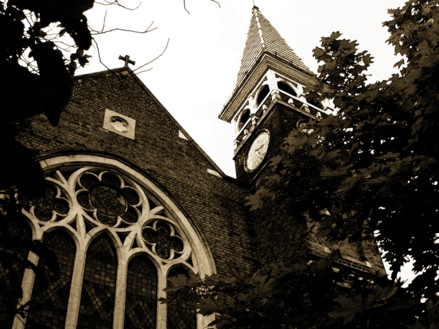
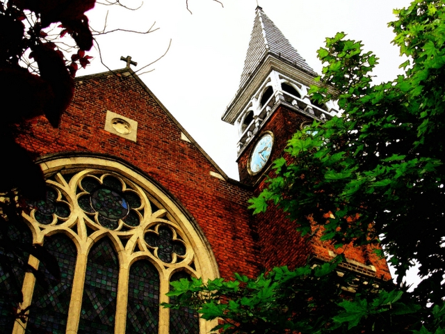
Yes, I’m back from Scotland….but more of that tomorrow. Even though I’m not Christian and not particularly religious I love churches and the peaceful atmosphere they create. Here’s the conundrum , though. You’ve obviously seen that there are two different versions of the same shot. That is because:
- I think that churches look best in B/W so that explains the first shot.
- I like the earthy tones that one gets by using the Fresco Filter, so that explains the second shot.
So the objective, my esteemed critics is this – Pick your favourite and give me your views on it.
Photo Editing: Shadows in Picasa. Levels, Fresco FIlter and Desturate(for first one) in Photoshop.
Nikon L101, 8mm, 1/483s, f/3.1, ISO:50


I really like the top, I think the colors in the bottom seem a little too saturated. Interesting angle, I like it a lot.
B/W -> Perfect
Colour -> Could have been better if the sky wasn’t blown out i.e a dark blue sky against the red would have been awesome.
Welcome back!!
Welcome back! You’ve been missed!
I agree with Faustina about the color saturation; a wee bit much. I do like them both but the B&W get’s my fav vote.
It is a great angle. Architecture is difficult and you captured it at it’s best.
Hugs!
=:-}
Interesting angle, works for me, Now I wish there was some dramtic sky in the image to give this image a complete look, One thing I really don’t understand why you do is start working on your images in picasa then move to photoshop, (thought you was going to stop) lol. Anyway, I love dark shadows in shots, but you are starting to loose details like the lovely leaves on the left, and too much shadow on the shrub on the left.Also how much sharpen did you do to this shot(sharpen or contrast), whichever ones seems a tad too much, there are sometimes when an image needs a soft tone. To me both images are good (the capture) then the editing gets mentioned and I start to wonder. Which is my fav? Truth is they both are, Both the monochrome and the colour are lovely images, BUT for the editing, sometimes it’s good to keep the editing to the bearest minum while at the same time editing the hell out of the image, When that last sentence starts to make sense, then you have cracked it.
I would say go back to this shot, less editing, Let the beaty of the leaves/shrubs shine through (why hid them with so much shadows), You can leave the building as is.
You can achieve this by working with layers.
Suby
I prefer the colour shot…great to have you back. Phil
As much as I am a big fan of b&w, gotta go with the color here.
I know you can always pp, but a simple polarizing filter can help with the skies in these situations sometimes, and save you time later in the digital darkroom.
yep, the sky unfortunately lets the shot down .. which make me lean heavily towards the b&w version
i am certainly not christian (or religious), but i do too love churches (along with mosques etc) … but they don’t make them the same way anymore – no longer are they beautiful or architecturally stunning – now they are like boxes, etc .. which to me kinda makes more sense – it doesn’t matter how the vessel looks, it’s purpose is to channel god(s)
nice to see yer back 😉
In your conversion you should have used the channel mixer, you could create good contrast between the green and the red on the church.
Shadows? I suggest using the technique here (http://www.paulpolitis.com/digressions_making_photograph.html) for recovering better tonal dislay with shadows.
The sky is a bit too washed out. The black and white is a bit muddy. Try using either channel mixer or gradiant map to convert to black and white. I prefer gradient mapping, but it doesn’t always work for all images in which case I use channel mixer.
What Suby said.
[ sorry for the short comments pretty tired after typing that long post ]